import numpy as np
import pandas as pd
import plotly.express as px
import plotly.io as pioplotly | 뉴욕 택시 자료 시각화
plotly
plotly로 뉴욕의 시간 별 택시 자료를 월드맵으로 시각화해보자!
1. 라이브러리 imports
pd.options.plotting.backend = 'plotly' ## 백엔드 기본 설정 변경
pio.templates.default = 'plotly_white' ## 템플릿 변경2. 뉴욕
A. 뉴욕의 주요 명소
# 뉴욕의 주요 명소 및 위치를 데이터프레임으로 생성
nyc_landmarks = {
"Name": ["Wall Street", "Midtown Manhattan", "Times Square",
"Central Park", "Statue of Liberty", "Forest Park", "Citi Field"],
"Latitude": [40.7074, 40.7549, 40.7580, 40.785091, 40.6892, 40.7028, 40.7571],
"Longitude": [-74.0113, -73.9840, -73.9855, -73.968285, -74.0445, -73.8495, -73.8458]
}
df_nyc_landmarks = pd.DataFrame(nyc_landmarks)
df_nyc_landmarks| Name | Latitude | Longitude | |
|---|---|---|---|
| 0 | Wall Street | 40.707400 | -74.011300 |
| 1 | Midtown Manhattan | 40.754900 | -73.984000 |
| 2 | Times Square | 40.758000 | -73.985500 |
| 3 | Central Park | 40.785091 | -73.968285 |
| 4 | Statue of Liberty | 40.689200 | -74.044500 |
| 5 | Forest Park | 40.702800 | -73.849500 |
| 6 | Citi Field | 40.757100 | -73.845800 |
뉴욕 내부 지역에 대한 좌표값들이다.
### B. 시각화
## 코로플레스가 아니라 점을 찍는거임
fig = px.scatter_mapbox(
data_frame = df_nyc_landmarks, ## 좌표 데이터
lat = 'Latitude', ## 위도에 해당하는 열 이름
lon = 'Longitude', ## 경도에 해당하는 열 이름
hover_data = 'Name', ## 추가적으로 띄울 정보
#---#
mapbox_style = 'carto-positron', ## 안해주면 에러남
zoom = 10,
width = 750,
height = 600
)
fig.show(config = {'scrollZoom' : False})일단 만들어봤는데, 점들의 크기를 좀 키우고 싶다.(geom_point의 업데이트)
fig = px.scatter_mapbox(
data_frame = df_nyc_landmarks,
lat = 'Latitude',
lon = 'Longitude',
hover_data = 'Name',
#---#
mapbox_style = 'carto-positron',
zoom = 10,
width = 750,
height = 600
)
fig.update_traces(
marker = {
'size' : 15,
'color' : 'red',
'opacity' : 0.5
}
) ## traces(점들)를 모두 업데이트함
fig.show(config={'scrollZoom':False})C. ChatGPT 지역설명
ChatGPT
뉴욕은 세계에서 가장 중요한 금융 및 문화 중심지 중 하나로, 금융권 밀집 지역과 유명한 관광 명소가 많습니다. 다음은 뉴욕의 대표적인 금융권 밀집 지역과 주요 관광 명소 중 일부입니다:
금융권 밀집 지역
- 월스트리트 (Wall Street):
- 월스트리트는 세계 금융의 상징이며, 뉴욕증권거래소(NYSE)와 많은 은행 및 금융 기관의 본사가 위치해 있습니다.
- 이 지역은 글로벌 금융 및 경제의 중심지로 간주되며, ’월스트리트’는 종종 미국 금융 산업 전체를 지칭하는 용어로 사용됩니다.
- 미드타운 (Midtown):
- 미드타운 맨해튼은 많은 기업 본사, 유명 호텔, 쇼핑 지역 및 레스토랑이 밀집해 있는 지역입니다.
- 이 지역에는 국제연합 본부, 메이시스 백화점, 록펠러 센터 등이 위치해 있습니다.
주요 관광 명소
- 타임스퀘어 (Times Square):
- 타임스퀘어는 뉴욕의 상징적인 관광 명소 중 하나로, 번화한 광고판과 네온사인으로 유명합니다.
- 이곳은 맨해튼의 중심부에 위치하며, 연극과 뮤지컬이 상연되는 브로드웨이 극장가로도 유명합니다.
- 센트럴 파크 (Central Park):
- 센트럴 파크는 뉴욕 시의 대표적인 공원으로, 도심 속 자연을 즐길 수 있는 아름다운 장소입니다.
- 공원 내에는 호수, 산책로, 놀이터, 스포츠 시설 등이 마련되어 있으며, 다양한 문화 행사와 공연이 열립니다.
- 자유의 여신상 (Statue of Liberty):
- 자유의 여신상은 뉴욕 항구에 위치한 미국의 상징적인 조각상입니다.
- 자유의 여신상은 미국의 자유와 민주주의를 상징하며, 세계적으로 유명한 관광 명소입니다.
- 포레스트 공원 (Forest Park):
- 이 공원은 뉴욕시 퀸즈 구역에 위치해 있습니다.
- 포레스트 공원은 약 538 에이커의 면적을 가지고 있으며, 다양한 레크리에이션 활동 및 자연 트레일을 제공합니다.
- 시티 필드 (Citi Field):
- 시티 필드는 뉴욕시 퀸즈 구역에 위치한 야구 경기장입니다.
- 이 경기장은 메이저 리그 야구의 뉴욕 메츠 팀의 홈 구장으로 사용됩니다.
3. NYCTaxi 자료
ref: https://www.kaggle.com/competitions/nyc-taxi-trip-duration/overview
캐글의 택시 요금을 예측하는 자료를 가져와보자.
### A. 데이터 불러오기
df = pd.read_csv("https://raw.githubusercontent.com/guebin/DV2023/main/posts/NYCTaxi.csv")
df.columnsIndex(['id', 'vendor_id', 'pickup_datetime', 'dropoff_datetime',
'passenger_count', 'pickup_longitude', 'pickup_latitude',
'dropoff_longitude', 'dropoff_latitude', 'store_and_fwd_flag',
'trip_duration'],
dtype='object')df.head()| id | vendor_id | pickup_datetime | dropoff_datetime | passenger_count | pickup_longitude | pickup_latitude | dropoff_longitude | dropoff_latitude | store_and_fwd_flag | trip_duration | |
|---|---|---|---|---|---|---|---|---|---|---|---|
| 0 | id2875421 | 2 | 2016-03-14 17:24:55 | 2016-03-14 17:32:30 | 1 | -73.982155 | 40.767937 | -73.964630 | 40.765602 | N | 455 |
| 1 | id3194108 | 1 | 2016-06-01 11:48:41 | 2016-06-01 12:19:07 | 1 | -74.005028 | 40.746452 | -73.972008 | 40.745781 | N | 1826 |
| 2 | id3564028 | 1 | 2016-01-02 01:16:42 | 2016-01-02 01:19:56 | 1 | -73.954132 | 40.774784 | -73.947418 | 40.779633 | N | 194 |
| 3 | id1660823 | 2 | 2016-03-01 06:40:18 | 2016-03-01 07:01:37 | 5 | -73.982140 | 40.775326 | -74.009850 | 40.721699 | N | 1279 |
| 4 | id1575277 | 2 | 2016-06-11 16:59:15 | 2016-06-11 17:33:27 | 1 | -73.999229 | 40.722881 | -73.982880 | 40.778297 | N | 2052 |
B. 데이터 설명
kaggle
id: a unique identifier for each tripvendor_id: a code indicating the provider associated with the trip recordpickup_datetime: date and time when the meter was engageddropoff_datetime: date and time when the meter was disengagedpassenger_count: the number of passengers in the vehicle (driver entered value)pickup_longitude: the longitude where the meter was engagedpickup_latitude: the latitude where the meter was engageddropoff_longitude: the longitude where the meter was disengageddropoff_latitude: the latitude where the meter was disengagedstore_and_fwd_flag: This flag indicates whether the trip record was held in vehicle memory before sending to the vendor because the vehicle did not have a connection to the server - Y=store and forward; N=not a store and forward triptrip_duration: duration of the trip in seconds
ChatGPT
- id : 택시 고유번호
- vender_id : 택시 관련 서비스 제공업체(우버, 카카오 등 그런거)
- pickup_datetime, dropoff_datetime : 승차시간, 하차시간
- passenger_cound : 탑승객 수
- pickup_longitude, pickup_latitude : 승차 지역의 경도와 위도
- dropoff_longitude, dropoff_latitude : 하차지역의 위도와 경도
- store_and_fwd_flag : 차량이 서버에 연결되어 있을 때 저장 후 전송되었음의 여부(N은 실시간 전송되었음)
- trip_duration : 이동 총 소요 시간
### C. 변수탐색
- 1단계 : df.info()
df.info()<class 'pandas.core.frame.DataFrame'>
RangeIndex: 14587 entries, 0 to 14586
Data columns (total 11 columns):
# Column Non-Null Count Dtype
--- ------ -------------- -----
0 id 14587 non-null object
1 vendor_id 14587 non-null int64
2 pickup_datetime 14587 non-null object
3 dropoff_datetime 14587 non-null object
4 passenger_count 14587 non-null int64
5 pickup_longitude 14587 non-null float64
6 pickup_latitude 14587 non-null float64
7 dropoff_longitude 14587 non-null float64
8 dropoff_latitude 14587 non-null float64
9 store_and_fwd_flag 14587 non-null object
10 trip_duration 14587 non-null int64
dtypes: float64(4), int64(3), object(4)
memory usage: 1.2+ MBdf.pickup_datetime[0] ## 깔끔하게 시간 형태로 변환하기 좋다.'2016-03-14 17:24:55'set(df.vendor_id){1, 2}
- 깔끔한 형태이며 결측치도 없음.
pickup_datetime등 시간을 나타내는 것은 나중에 형태변환을 할 필요가 있음.vendor_id는 실제로는 범주형 자료를 의미함(더미변수)
- 2단계 : 범주형자료의 빈도를 조사
df['vendor_id'].value_counts() ## 개별 값들이 얼마나 많이 있는지 산출한다.
## list(df['vendor_id']).count(1), list(df['vendor_id']).count(2)vendor_id
2 7818
1 6769
Name: count, dtype: int64df['store_and_fwd_flag'].value_counts()store_and_fwd_flag
N 14506
Y 81
Name: count, dtype: int64실시간으로 보내진 자료는 훨씬 적음(구분하는 게 의미가 없어보임)
- 3단계 : 연속형변수의 분포를 조사
df.info()<class 'pandas.core.frame.DataFrame'>
RangeIndex: 14587 entries, 0 to 14586
Data columns (total 11 columns):
# Column Non-Null Count Dtype
--- ------ -------------- -----
0 id 14587 non-null object
1 vendor_id 14587 non-null int64
2 pickup_datetime 14587 non-null object
3 dropoff_datetime 14587 non-null object
4 passenger_count 14587 non-null int64
5 pickup_longitude 14587 non-null float64
6 pickup_latitude 14587 non-null float64
7 dropoff_longitude 14587 non-null float64
8 dropoff_latitude 14587 non-null float64
9 store_and_fwd_flag 14587 non-null object
10 trip_duration 14587 non-null int64
dtypes: float64(4), int64(3), object(4)
memory usage: 1.2+ MB실질적으로 연속형 자료는
passenger_count와trip_duration정도이다.(나머지는 아이디나 좌표정보, 시간 정보이다.)
df.plot.hist(x = 'passenger_count')1ㆍ2인 승객이 많고, 4인은 드물다. 5~6인은 4인보다 많다.
df.plot.hist(x = 'trip_duration')거리가 짧은 쪽에 많이 몰려있지만, 이동거리가 매우 긴 승객들도 있다. (너무 큰 값들이 존재함)
너무 큰 값이 존재할 경우, 구간이 넓어지고 한쪽에 값이 몰리게 되어 색상으로 시각화하기에 어려움이 있다.
D. 데이터 변환
# log변환
- trip_duration의 스케일이 너무 크므로, log_trip_duration을 추가.
np.log(df.trip_duration).plot.hist() ## numpy array에도 plot메소드가 있음...범위가 줄어들어서 훨씬 시각화하기에도 좋아보임.
# datetime 처리
- pickup_datetime에서 시간(hour)만 추출하고 싶어…
df.pickup_datetime0 2016-03-14 17:24:55
1 2016-06-01 11:48:41
2 2016-01-02 01:16:42
3 2016-03-01 06:40:18
4 2016-06-11 16:59:15
...
14582 2016-05-16 22:12:09
14583 2016-05-23 08:04:35
14584 2016-05-31 16:56:13
14585 2016-03-07 18:11:54
14586 2016-05-09 17:26:56
Name: pickup_datetime, Length: 14587, dtype: objectdf.pickup_datetime.str.split(' ').str[-1].str.split(':').str[0].astype('int') ## 단순무식한 방법0 17
1 11
2 1
3 6
4 16
..
14582 22
14583 8
14584 16
14585 18
14586 17
Name: pickup_datetime, Length: 14587, dtype: int32- 애초에 잘 저장된 친구인데 해당 형태를 이용할 수는 없나?
df.pickup_datetime.apply(pd.to_datetime).dt.hour
##pd.to_datetime(df.pickup_datetime) < 이쪽이 연산속도는 훨씬 빨랐음.0 17
1 11
2 1
3 6
4 16
..
14582 22
14583 8
14584 16
14585 18
14586 17
Name: pickup_datetime, Length: 14587, dtype: int32이렇게 되면 pandas의 날짜 형태로 자료가 들어가서 추출하는 데에 용이하다.
- pickup_datetime에서 요일을 추출
pd.to_datetime(df.pickup_datetime).dt.dayofweek ## 방법 10 0
1 2
2 5
3 1
4 5
..
14582 0
14583 0
14584 1
14585 0
14586 0
Name: pickup_datetime, Length: 14587, dtype: int320이 월요일, 6이 일요일
df.pickup_datetime.apply(pd.to_datetime).dt.strftime("%A") ## 방법 1(일단 외워야 할듯)0 Monday
1 Wednesday
2 Saturday
3 Tuesday
4 Saturday
...
14582 Monday
14583 Monday
14584 Tuesday
14585 Monday
14586 Monday
Name: pickup_datetime, Length: 14587, dtype: object시각적으로 유용할 때가 있음…
- 시간의 연산 / dropoff_datetime - pickup_datetime을 계산 & df.trip_duration과 비교
pd.to_datetime(df.dropoff_datetime) - pd.to_datetime(df.pickup_datetime)0 0 days 00:07:35
1 0 days 00:30:26
2 0 days 00:03:14
3 0 days 00:21:19
4 0 days 00:34:12
...
14582 0 days 00:15:37
14583 0 days 00:14:45
14584 0 days 00:42:31
14585 0 days 00:17:15
14586 0 days 01:03:41
Length: 14587, dtype: timedelta64[ns]
dtype이 datetime이라면, 판다스 내부에서 연산을 진행할 수 있다.
df.trip_duration ## 택시를 탄 시간(초)0 455
1 1826
2 194
3 1279
4 2052
...
14582 937
14583 885
14584 2551
14585 1035
14586 3821
Name: trip_duration, Length: 14587, dtype: int64인덱스별로 시간이 동일함…
# dist, speed 추가
- 승차 위치와 하차 위치를 이용하여 거리를 계산
dist = np.sqrt((df.pickup_latitude - df.dropoff_latitude)**2 + (df.pickup_longitude - df.dropoff_longitude)**2)
dist0 0.017680
1 0.033027
2 0.008282
3 0.060363
4 0.057778
...
14582 0.035054
14583 0.023886
14584 0.132513
14585 0.023439
14586 0.228013
Length: 14587, dtype: float64- 사실 위와 같이 거리를 계산하면 잘못되긴 함…
실제로 저 직선경로로 차가 이동하지 않음
곡면에 따른 직선 거리 왜곡…
경도 표기상의 스케일 왜곡(위도가 높을수록 경도당 이동거리는 줄어듦…)
그래도 대충 비슷하긴 하니까… 계산은 할거다.(이럴 경우 위처럼 한계점을 써줘야 함)
dist.plot.hist()굳이 로그변환 하지 않아도 상관없을 것 같음…(나중에 필요할 때 하면 된다. 색깔 넣을때)
- 속력을 계산
(dist / df.trip_duration).plot.hist()이동거리를 시간(초)으로 나눔…(초속임)
### E. df_feature 생성
df.columnsIndex(['id', 'vendor_id', 'pickup_datetime', 'dropoff_datetime',
'passenger_count', 'pickup_longitude', 'pickup_latitude',
'dropoff_longitude', 'dropoff_latitude', 'store_and_fwd_flag',
'trip_duration'],
dtype='object')df_feature = df.assign(
log_trip_duration = np.log(df.trip_duration), ## 로그변환
pickup_datetime = pd.to_datetime(df.pickup_datetime), ## datetime 형식으로 변환
dropoff_datetime = pd.to_datetime(df.dropoff_datetime),
dist = np.sqrt((df.pickup_latitude - df.dropoff_latitude)**2 + (df.pickup_longitude - df.dropoff_longitude)**2),
#---#
vendor_id = df.vendor_id.map({1:'A', 2:'B'}) ## 범주형으로 명시, 딕셔너리와 map()을 이용
).assign(
speed = lambda _df : _df.dist / _df.trip_duration,
pickup_hour = lambda _df : _df.pickup_datetime.dt.hour, ## 탑승 시간을 할당
dropoff_hour = lambda _df : _df.dropoff_datetime.dt.hour,
dayofweek = lambda _df : _df.pickup_datetime.dt.dayofweek ## 탑승한 시점으로 요일을 잡음
)df_feature.head()| id | vendor_id | pickup_datetime | dropoff_datetime | passenger_count | pickup_longitude | pickup_latitude | dropoff_longitude | dropoff_latitude | store_and_fwd_flag | trip_duration | log_trip_duration | dist | speed | pickup_hour | dropoff_hour | dayofweek | |
|---|---|---|---|---|---|---|---|---|---|---|---|---|---|---|---|---|---|
| 0 | id2875421 | B | 2016-03-14 17:24:55 | 2016-03-14 17:32:30 | 1 | -73.982155 | 40.767937 | -73.964630 | 40.765602 | N | 455 | 6.120297 | 0.017680 | 0.000039 | 17 | 17 | 0 |
| 1 | id3194108 | A | 2016-06-01 11:48:41 | 2016-06-01 12:19:07 | 1 | -74.005028 | 40.746452 | -73.972008 | 40.745781 | N | 1826 | 7.509883 | 0.033027 | 0.000018 | 11 | 12 | 2 |
| 2 | id3564028 | A | 2016-01-02 01:16:42 | 2016-01-02 01:19:56 | 1 | -73.954132 | 40.774784 | -73.947418 | 40.779633 | N | 194 | 5.267858 | 0.008282 | 0.000043 | 1 | 1 | 5 |
| 3 | id1660823 | B | 2016-03-01 06:40:18 | 2016-03-01 07:01:37 | 5 | -73.982140 | 40.775326 | -74.009850 | 40.721699 | N | 1279 | 7.153834 | 0.060363 | 0.000047 | 6 | 7 | 1 |
| 4 | id1575277 | B | 2016-06-11 16:59:15 | 2016-06-11 17:33:27 | 1 | -73.999229 | 40.722881 | -73.982880 | 40.778297 | N | 2052 | 7.626570 | 0.057778 | 0.000028 | 16 | 17 | 5 |
운행시간을 로그변환한 값과
datetime의 형식으로 변환한 시간 자료들, 거리를 추가하였고, 그에 따른 초속과 승하차 시간(hour), 요일에 대한 정보를 추가적으로 할당하였다.
4. 시각화1 : scatter/density
A. scatter(scatter_mapbox) 간단한 시각화
df_feature.columnsIndex(['id', 'vendor_id', 'pickup_datetime', 'dropoff_datetime',
'passenger_count', 'pickup_longitude', 'pickup_latitude',
'dropoff_longitude', 'dropoff_latitude', 'store_and_fwd_flag',
'trip_duration', 'log_trip_duration', 'dist', 'speed', 'pickup_hour',
'dropoff_hour', 'dayofweek'],
dtype='object')## 위에서 썼던 코드 이용
fig = px.scatter_mapbox(
data_frame = df_feature, ## 피쳐 엔지니어링 된 자료
lat = 'pickup_latitude', ## 어디서 타는지 시각화
lon = 'pickup_longitude',
center = {'lat':40.7322, 'lon':-73.9052}, ## 시작위치 지정해줄 수 있음, 자료가 있는 쪽으로 알아서 생성되긴 하지만...
#---#
mapbox_style = 'carto-positron',
zoom=10,
width=750,
height=600
)
fig.update_traces(
marker = {
'size':2,
}
)
fig.show(config={'scrollZoom':False})해당 그림도 의미가 있음, 여기서
opacity를 작게,size를 크게 해서 밀도를 표현할수도 있지만…scattter_mapbox는 애초에 산점도 전문이다.
### B. density(density_mapbox)
df_feature.columnsIndex(['id', 'vendor_id', 'pickup_datetime', 'dropoff_datetime',
'passenger_count', 'pickup_longitude', 'pickup_latitude',
'dropoff_longitude', 'dropoff_latitude', 'store_and_fwd_flag',
'trip_duration', 'log_trip_duration', 'dist', 'speed', 'pickup_hour',
'dropoff_hour', 'dayofweek'],
dtype='object')fig = px.density_mapbox(
data_frame = df_feature,
lat = 'pickup_latitude',
lon = 'pickup_longitude',
radius = 1, ## 각 점의 크기
center = {'lat':40.7322, 'lon':-73.9052},
#---#
mapbox_style = 'carto-positron',
zoom=10,
width=750,
height=600
)
fig.show(config = {'scrollZoom' : False})5. 시각화 2 : scatter/density + \(\alpha\)
맨날 각 데이터 눌러가면서 hover_data 확인하는 것 말고 한번에 볼 수 있는 방법은 없을까?
A. density + passenger_count
df_feature.columnsIndex(['id', 'vendor_id', 'pickup_datetime', 'dropoff_datetime',
'passenger_count', 'pickup_longitude', 'pickup_latitude',
'dropoff_longitude', 'dropoff_latitude', 'store_and_fwd_flag',
'trip_duration', 'log_trip_duration', 'dist', 'speed', 'pickup_hour',
'dropoff_hour', 'dayofweek'],
dtype='object')fig = px.density_mapbox(
data_frame = df_feature,
lat = 'pickup_latitude',
lon = 'pickup_longitude',
radius = 2, ## 줌 스케일과 무관하게 크기가 상대적으로 설정됨
center = {'lat' : 40.7322, 'lon' : -73.9052},
z = 'passenger_count', ## z축, 다른 변수를 지정
#---#
mapbox_style = 'carto-positron',
zoom = 10,
width = 750,
height = 600
)
fig.show(config = {'scrollZoom' : False})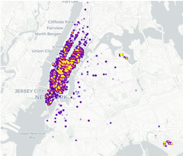
딱히 density만을 plot한 것과 거의 차이가 없어보인다…
따라서 특정 지역에 다수 손님이 타는 경향이 더 있다고 보기 어렵다.
! 언더라잉(원자료)와 비교해서 차이가 있는지를 비교해야 의미가 있다!
### B. density + log_trip_duration
df_feature.columnsIndex(['id', 'vendor_id', 'pickup_datetime', 'dropoff_datetime',
'passenger_count', 'pickup_longitude', 'pickup_latitude',
'dropoff_longitude', 'dropoff_latitude', 'store_and_fwd_flag',
'trip_duration', 'log_trip_duration', 'dist', 'speed', 'pickup_hour',
'dropoff_hour', 'dayofweek'],
dtype='object')fig = px.density_mapbox(
data_frame = df_feature,
lat = 'pickup_latitude',
lon = 'pickup_longitude',
radius = 1.5,
center = {'lat' : 40.7322, 'lon' : -73.9052},
z = 'log_trip_duration',
#---#
mapbox_style = 'carto-positron',
zoom=10,
width=750,
height=600
)
fig.show(config = {'scrollZoom':False})이것도 density만을 plot한 것과 큰 차이가 없어보임… 따라서 이 그림상으론 특정 지역에서 주행 시간이 긴 손님이 많이 분포한다고 판단하기 어려워보임.
시간은 교통 체증이나 이런 걸로도 오래 걸릴 수 있으니까…
C. density + dist(duration과 일반적으로 비례하긴 함…)
fig = px.density_mapbox(
data_frame = df_feature,
lat = 'pickup_latitude',
lon = 'pickup_longitude',
radius = 3,
center = {'lat':40.7322, 'lon':-73.9052},
z = 'dist', ## 거리로 색상을 추가...
#---#
mapbox_style = 'carto-positron',
zoom=10,
width=750,
height=600
)
fig.show(config={'scrollZoom':False})차이가 있어보임. 장거리 손님의 경우 멀리 떨어져 있는 지역의 색상이 짙게 나왔다.
시티필드, 포레스트공원에는 확실히 장거리 손님이 많다고 해석됨
### D. density + speed(얘는 duration이랑 dist와 엮여서 관련있을듯)
fig = px.density_mapbox(
data_frame = df_feature,
lat = 'pickup_latitude',
lon = 'pickup_longitude',
radius=2.5,
center = {'lat':40.7322, 'lon':-73.9052},
z = 'speed',
#---#
mapbox_style = 'carto-positron',
zoom=10,
width=750,
height=600
)
fig.show(config={'scrollZoom':False})위에서와 유사하게 시티필드, 포레스트공원의 속도가 중심부보다 높은 것을 볼 수 있음.
타임스퀘어, 미드타운의 속도가 density만을 plot한 것에 비해 옅은 것을 보아 낮음을 확인할 수 있음.
E. scatter + vendor_id
fig = px.scatter_mapbox(
data_frame = df_feature,
lat = 'pickup_latitude',
lon = 'pickup_longitude',
center = {'lat':40.7322, 'lon':-73.9052},
color = 'vendor_id', ## density의 경우 애초에 밀도로 색상을 고려하니까 z이고, 여긴 color를 지정
#---#
mapbox_style = 'carto-positron',
zoom=10,
width=750,
height=600
)
fig.update_traces(
marker = {
'size':2,
} ## 사이즈의 경우 scatter_mapbox에 직접 지정해줄 수도 있지만, 이렇게 업데이트 해줄 수도 있다.
)
fig.show(config={'scrollZoom':False})어딘 A업체를 많이 타고, 어딘 B업체를 많이 타고… 뭐 그런 건 없고 고르게 분포한 것 같음.
### F. scatter + dayofweek
- dayofweek은 정수형으로 저장되어 있으나, 사실 범주형임…(가공이 필요)
fig = px.scatter_mapbox(
data_frame = df_feature.assign(dayofweek = df_feature.dayofweek.astype(str)).sort_values('dayofweek'), ## 요일을 범주형으로 추가하고, 순서대로 보이게 만듦
lat = 'pickup_latitude',
lon = 'pickup_longitude',
center = {'lat':40.7322, 'lon':-73.9052},
color = 'dayofweek',
#---#
mapbox_style = 'carto-positron',
zoom=10,
width=750,
height=600
)
fig.update_traces(
marker = {
'size':3,
}
)
fig.show(config={'scrollZoom':False})요일별로 차이가 있을 줄 알았는데, 이 그림만으론 요일별 차이가 없어보임…
6. 시각화 3 : 애니메이션
A. scatter / (vendor_id, passenger_count, hour)
df_feature.columnsIndex(['id', 'vendor_id', 'pickup_datetime', 'dropoff_datetime',
'passenger_count', 'pickup_longitude', 'pickup_latitude',
'dropoff_longitude', 'dropoff_latitude', 'store_and_fwd_flag',
'trip_duration', 'log_trip_duration', 'dist', 'speed', 'pickup_hour',
'dropoff_hour', 'dayofweek'],
dtype='object')fig = px.scatter_mapbox(
data_frame = df_feature.sort_values('pickup_hour'), ## 인덱스 순서가 제대로 되도록...
lat = 'pickup_latitude',
lon = 'pickup_longitude',
color = 'vendor_id',
size = 'passenger_count', size_max = 5,
animation_frame = 'pickup_hour',
center = {'lat' : 40.7322, 'lon' : -73.9052},
#---#
mapbox_style = 'carto-positron',
zoom = 10,
width = 750,
height = 600
)
fig.show(config = {'scrollZoom' : False})B가 전체적으로 동그라미가 더 크다.(
passenger_count) : 한 택시에 탑승하는 승객 수는 B업체가 더 많은듯)시간대별로 확실히 빈도수가 다르다.(오후 늦은 시간대가 제일 많은듯? 6시~9시)
이렇게 시각화하여 느낌적인 느낌을 알아보고, 그것을 중심으로 시각화해보면 좋다.
- 추가 시각화 1 : vendor_id별 평균 탑승객 수를 바플랏으로 시각화
df_feature.groupby('vendor_id').agg({'passenger_count' : 'mean'}).reset_index().plot.bar(x = 'passenger_count', y = 'vendor_id', color = 'vendor_id')확실히 B사가 택시 당 평균 승객 수가 많다. 대형차량 위주로 운용하는 회사가 아닐까?
- 추가 시각화 2 : vendor_id별 passenger_count를 boxplot으로 시각화
df_feature.sort_values('vendor_id').plot.box(x = 'vendor_id', y = 'passenger_count', color = 'vendor_id')- 추가 시각화 3 : 히스토그램
df_feature.plot.hist(x = 'passenger_count', color = 'vendor_id', facet_col = 'vendor_id')- 추가 시각화 4 : pickup_hour별 count를 바플랏으로 시각화(시간별로 얼마나 타는지 비교, 시간이 딱딱 끊어져 있으므로 히스토그램보다 이게 더 낫긴 할듯)
df_feature.pickup_hour.value_counts().sort_index().plot.bar() ## 각 시간마다 행이 몇개인지 세는 게 되겠지.
#df_feature.groupby('pickup_hour').agg({'pickup_hour' : 'count'}) ## count대신 len도 되고, size도 되고...
#[len(df) for i, df in df_feature.groupby('pickup_hour')] 이렇게 해서 assign해도 되고... 등등- 추가 시각화 5 : (pickup_hour, vendor_id) 별 count를 바플랏으로 시각화
df_feature.groupby(['pickup_hour', 'vendor_id']).agg('size').reset_index().rename({0 : 'count'}, axis = 1)\
.plot.bar(x = 'pickup_hour', y = 'count', color = 'vendor_id', facet_col = 'vendor_id')- 추가 시각화 6 : areaplot으로 시각화
df_feature.groupby(['pickup_hour', 'vendor_id']).agg('size').reset_index().rename({0 : 'count'}, axis = 1)\
.plot.area(x = 'pickup_hour', y = 'count', color = 'vendor_id')B의 경우는 5시 즈음에서, 16시 즈음에서 늘어나는 수준이 높다.
- 추가 시각화 7 : 라인플랏
df_feature.groupby(['pickup_hour', 'vendor_id']).agg('size').reset_index().rename({0 : 'count'}, axis = 1)\
.plot.line(x = 'pickup_hour', y = 'count', color = 'vendor_id')전체적인 포지션을 시각화하기엔 에리어 플랏도 좋다.
### B. scatter / (vendor_id, dayofweek)
fig = px.scatter_mapbox(
data_frame = df_feature.sort_values('dayofweek'), ## 야매로 무조건 해줘야함
lat = 'pickup_latitude',
lon = 'pickup_longitude',
color = 'vendor_id',
size = 'passenger_count', size_max = 5,
animation_frame = 'dayofweek',
center = {'lat':40.7322, 'lon':-73.9052},
#---#
mapbox_style = 'carto-positron',
zoom = 10,
width = 750,
height = 600
)
fig.show(config = {"scrollZoom" : False})생각보다 요일별 특징은 그닥 뚜렷하지 않았음…
7. 시각화 3 - heatmap
A. (요일, 시간)에 따른 count 시각화
tidydata = df_feature.pivot_table(
index = 'pickup_hour',
columns = 'dayofweek',
aggfunc = 'size' ## size를 넣음으로써 value를 대체, value를 id로 넣고 함수를 len으로 적용해도 됨
).stack().reset_index().rename({0 : 'count'}, axis = 1)
px.density_heatmap(
data_frame = tidydata,
x = 'pickup_hour',
y = 'dayofweek',
z = 'count', ## 밀도라 z축으로 색상을 택해야 함.
nbinsx = 24, ## number of bins for x, 시간이니까 24개
nbinsy = 7, ## 요일이니까 7개
height = 300
)1~4의 18~21시가 밝아보임.
토요일, 일요일 새벽과 목금토 밤은 더 밝아보임 \(\to\) 불금???
### B. (요일, 시간)에 따른 dist 시각화
tidydata = df_feature.pivot_table(
index = 'dayofweek',
columns = 'pickup_hour',
values = 'dist',
aggfunc = 'mean'
).stack().reset_index().rename({0 : 'dist_mean'}, axis = 1)
px.density_heatmap(
data_frame = tidydata,
x = 'pickup_hour',
y = 'dayofweek',
z = 'dist_mean', ## 밀도라 z축으로 색상을 택해야 함.
nbinsx = 24, ## number of bins for x, 시간이니까 24개
nbinsy = 7, ## 요일이니까 7개
height = 300
)일요일 아침이 샛노랗네…?(여행을 끝내고 복귀하는 사람들이지 않을까?)
C. (요일, 시간)에 따른 speed 시각화
df_feature.columnsIndex(['id', 'vendor_id', 'pickup_datetime', 'dropoff_datetime',
'passenger_count', 'pickup_longitude', 'pickup_latitude',
'dropoff_longitude', 'dropoff_latitude', 'store_and_fwd_flag',
'trip_duration', 'log_trip_duration', 'dist', 'speed', 'pickup_hour',
'dropoff_hour', 'dayofweek'],
dtype='object')tidydata = df_feature.pivot_table(
index = 'dayofweek',
columns = 'pickup_hour',
values = 'speed',
aggfunc = 'mean'
).stack().reset_index().rename({0 : 'speed'}, axis = 1)
px.density_heatmap(
data_frame = tidydata,
x = 'pickup_hour',
y = 'dayofweek',
z = 'speed', ## 밀도라 z축으로 색상을 택해야 함.
nbinsx = 24, ## number of bins for x, 시간이니까 24개
nbinsy = 7, ## 요일이니까 7개
height = 300
)전체적으로 새벽시간때에는 속도가 빠름, 한산해서 교통체증이 심하지 않다.
8. 시각화 5 : 경로 시각화
경로 시각화는 무거워서 좀 작은 데이터로 실습합니다…
df_feature_small = df_feature[::100].reset_index(drop=True) ## 100칸 씩 건너뛰며 몇개만 추출
df_feature_small| id | vendor_id | pickup_datetime | dropoff_datetime | passenger_count | pickup_longitude | pickup_latitude | dropoff_longitude | dropoff_latitude | store_and_fwd_flag | trip_duration | log_trip_duration | dist | speed | pickup_hour | dropoff_hour | dayofweek | |
|---|---|---|---|---|---|---|---|---|---|---|---|---|---|---|---|---|---|
| 0 | id2875421 | B | 2016-03-14 17:24:55 | 2016-03-14 17:32:30 | 1 | -73.982155 | 40.767937 | -73.964630 | 40.765602 | N | 455 | 6.120297 | 0.017680 | 0.000039 | 17 | 17 | 0 |
| 1 | id3667993 | B | 2016-01-03 04:18:57 | 2016-01-03 04:27:03 | 1 | -73.980522 | 40.730530 | -73.997993 | 40.746220 | N | 486 | 6.186209 | 0.023482 | 0.000048 | 4 | 4 | 6 |
| 2 | id2002463 | B | 2016-01-14 12:28:56 | 2016-01-14 12:37:17 | 1 | -73.965652 | 40.768398 | -73.960068 | 40.779308 | N | 501 | 6.216606 | 0.012256 | 0.000024 | 12 | 12 | 3 |
| 3 | id1635353 | B | 2016-03-04 23:20:58 | 2016-03-04 23:49:29 | 5 | -73.985092 | 40.759190 | -73.962151 | 40.709850 | N | 1711 | 7.444833 | 0.054412 | 0.000032 | 23 | 23 | 4 |
| 4 | id1850636 | A | 2016-02-05 00:21:28 | 2016-02-05 00:52:24 | 1 | -73.994537 | 40.750439 | -74.025719 | 40.631100 | N | 1856 | 7.526179 | 0.123345 | 0.000066 | 0 | 0 | 4 |
| ... | ... | ... | ... | ... | ... | ... | ... | ... | ... | ... | ... | ... | ... | ... | ... | ... | ... |
| 141 | id0621879 | A | 2016-04-23 09:31:33 | 2016-04-23 09:51:33 | 1 | -73.950783 | 40.743614 | -74.006218 | 40.722729 | N | 1200 | 7.090077 | 0.059239 | 0.000049 | 9 | 9 | 5 |
| 142 | id2587483 | B | 2016-03-28 12:59:58 | 2016-03-28 13:08:11 | 2 | -73.953903 | 40.787079 | -73.940842 | 40.792461 | N | 493 | 6.200509 | 0.014127 | 0.000029 | 12 | 13 | 0 |
| 143 | id1030598 | B | 2016-03-03 11:44:24 | 2016-03-03 11:49:59 | 1 | -74.005066 | 40.719143 | -74.006065 | 40.735134 | N | 335 | 5.814131 | 0.016022 | 0.000048 | 11 | 11 | 3 |
| 144 | id3094934 | A | 2016-03-21 09:53:40 | 2016-03-21 10:22:20 | 1 | -73.986153 | 40.722431 | -73.985977 | 40.762669 | N | 1720 | 7.450080 | 0.040238 | 0.000023 | 9 | 10 | 0 |
| 145 | id0503659 | B | 2016-04-19 18:06:09 | 2016-04-19 18:23:09 | 2 | -73.952209 | 40.784500 | -73.966103 | 40.804832 | N | 1020 | 6.927558 | 0.024626 | 0.000024 | 18 | 18 | 1 |
146 rows × 17 columns
### A. 경로 그리기(px.line_mapbox())
- 경로를 그리는 것은 이미 함수로 나와있다.
df_sample = pd.DataFrame(
{'path':['A','A','B','B','B'],
'lon':[-73.986420,-73.995300,-73.975922,-73.988922,-73.962654],
'lat':[40.756569,40.740059,40.754192,40.762859,40.772449]}
)fig = px.line_mapbox(
data_frame = df_sample,
lat = 'lat',
lon = 'lon',
color = 'path',
line_group = 'path', ## 얜 넣으면 선분별로 그룹핑이 된다는데,,, 안해도 되네요. 왤까.
#---#
mapbox_style = 'carto-positron',
zoom=12,
width = 750,
height = 600
)
fig.show(config = {'scrollZoom' : False})뭔가 경유지가 점으로 표기되면 좋겠는데?
- 산점도로 그리기
_fig = px.scatter_mapbox(
data_frame = df_sample,
lat = 'lat',
lon = 'lon',
color = 'path',
#---#
mapbox_style = 'carto-positron',
zoom=12,
width = 750,
height = 600
)
_fig.show(config={'scrollZoom':False})- 합치기
px.scatter_mapbox(
data_frame=df_sample,
lat = 'lat',
lon = 'lon',
color = 'path',
#---#
mapbox_style = 'carto-positron',
zoom=12,
width = 750,
height = 600
).data(Scattermapbox({
'hovertemplate': 'path=A<br>lat=%{lat}<br>lon=%{lon}<extra></extra>',
'lat': array([40.756569, 40.740059]),
'legendgroup': 'A',
'lon': array([-73.98642, -73.9953 ]),
'marker': {'color': '#636efa'},
'mode': 'markers',
'name': 'A',
'showlegend': True,
'subplot': 'mapbox'
}),
Scattermapbox({
'hovertemplate': 'path=B<br>lat=%{lat}<br>lon=%{lon}<extra></extra>',
'lat': array([40.754192, 40.762859, 40.772449]),
'legendgroup': 'B',
'lon': array([-73.975922, -73.988922, -73.962654]),
'marker': {'color': '#EF553B'},
'mode': 'markers',
'name': 'B',
'showlegend': True,
'subplot': 'mapbox'
}))’mapbox
에data를 붙이게 되면 튜플 형태의mapbox`들이 나온다.
fig = px.line_mapbox(
data_frame=df_sample,
lat = 'lat',
lon = 'lon',
color = 'path',
line_group = 'path',
#---#
mapbox_style = 'carto-positron',
zoom=12,
width = 750,
height = 600
)
scatter_data = px.scatter_mapbox(
data_frame=df_sample,
lat = 'lat',
lon = 'lon',
color = 'path',
#---#
mapbox_style = 'carto-positron',
zoom=12,
width = 750,
height = 600
).data ## geom_point 느낌으로 추가할 수 있는 "데이터"
fig.add_trace(scatter_data[0]) ## 첫 번째 개체(빨간색)를 함침
fig.add_trace(scatter_data[1]) ## 두 번째 개체(파란색)를 합침, 많으면 for문 이용해서 다 넣어야 하나봐...
fig.show(config={'scrollZoom':False})fig = px.line_mapbox(
data_frame=df_sample,
lat = 'lat',
lon = 'lon',
color = 'path',
line_group = 'path',
#---#
mapbox_style = 'carto-positron',
zoom=12,
width = 750,
height = 600
).data
scatter_data = px.scatter_mapbox(
data_frame=df_sample,
lat = 'lat',
lon = 'lon',
color = 'path',
#---#
mapbox_style = 'carto-positron',
zoom=12,
width = 750,
height = 600
)
scatter_data.add_trace(fig[0])
scatter_data.add_trace(fig[1])
scatter_data.show(config={'scrollZoom':False})B. 전처리
_df = df_feature_small.loc[[0], :]
_df| id | vendor_id | pickup_datetime | dropoff_datetime | passenger_count | pickup_longitude | pickup_latitude | dropoff_longitude | dropoff_latitude | store_and_fwd_flag | trip_duration | log_trip_duration | dist | speed | pickup_hour | dropoff_hour | dayofweek | |
|---|---|---|---|---|---|---|---|---|---|---|---|---|---|---|---|---|---|
| 0 | id2875421 | B | 2016-03-14 17:24:55 | 2016-03-14 17:32:30 | 1 | -73.982155 | 40.767937 | -73.96463 | 40.765602 | N | 455 | 6.120297 | 0.01768 | 0.000039 | 17 | 17 | 0 |
탑승과 하차를 더미화시키고, 그것에 따른 데이터들을 늘이고 싶다.(long data로)
df_pickup = df_feature_small.drop([col for col in _df.columns if 'dropoff' in col], axis = 1).assign(type = 'pickup')\
.rename({col:col.split('_')[-1] for col in _df.columns if 'pickup' in col}, axis = 1)
df_dropoff = df_feature_small.drop([col for col in _df.columns if 'pickup' in col], axis = 1).assign(type = 'dropoff')\
.rename({col:col.split('_')[-1] for col in _df.columns if 'dropoff' in col}, axis = 1)pd.concat([df_pickup, df_dropoff], axis = 0).reset_index(drop = True)| id | vendor_id | datetime | passenger_count | longitude | latitude | store_and_fwd_flag | trip_duration | log_trip_duration | dist | speed | hour | dayofweek | type | |
|---|---|---|---|---|---|---|---|---|---|---|---|---|---|---|
| 0 | id2875421 | B | 2016-03-14 17:24:55 | 1 | -73.982155 | 40.767937 | N | 455 | 6.120297 | 0.017680 | 0.000039 | 17 | 0 | pickup |
| 1 | id3667993 | B | 2016-01-03 04:18:57 | 1 | -73.980522 | 40.730530 | N | 486 | 6.186209 | 0.023482 | 0.000048 | 4 | 6 | pickup |
| 2 | id2002463 | B | 2016-01-14 12:28:56 | 1 | -73.965652 | 40.768398 | N | 501 | 6.216606 | 0.012256 | 0.000024 | 12 | 3 | pickup |
| 3 | id1635353 | B | 2016-03-04 23:20:58 | 5 | -73.985092 | 40.759190 | N | 1711 | 7.444833 | 0.054412 | 0.000032 | 23 | 4 | pickup |
| 4 | id1850636 | A | 2016-02-05 00:21:28 | 1 | -73.994537 | 40.750439 | N | 1856 | 7.526179 | 0.123345 | 0.000066 | 0 | 4 | pickup |
| ... | ... | ... | ... | ... | ... | ... | ... | ... | ... | ... | ... | ... | ... | ... |
| 287 | id0621879 | A | 2016-04-23 09:51:33 | 1 | -74.006218 | 40.722729 | N | 1200 | 7.090077 | 0.059239 | 0.000049 | 9 | 5 | dropoff |
| 288 | id2587483 | B | 2016-03-28 13:08:11 | 2 | -73.940842 | 40.792461 | N | 493 | 6.200509 | 0.014127 | 0.000029 | 13 | 0 | dropoff |
| 289 | id1030598 | B | 2016-03-03 11:49:59 | 1 | -74.006065 | 40.735134 | N | 335 | 5.814131 | 0.016022 | 0.000048 | 11 | 3 | dropoff |
| 290 | id3094934 | A | 2016-03-21 10:22:20 | 1 | -73.985977 | 40.762669 | N | 1720 | 7.450080 | 0.040238 | 0.000023 | 10 | 0 | dropoff |
| 291 | id0503659 | B | 2016-04-19 18:23:09 | 2 | -73.966103 | 40.804832 | N | 1020 | 6.927558 | 0.024626 | 0.000024 | 18 | 1 | dropoff |
292 rows × 14 columns
## 교수님 방법(이렇게까지 할건 아닌 것 같은데...)
pcol = ['pickup_datetime', 'pickup_longitude', 'pickup_latitude', 'pickup_hour']
dcol = ['dropoff_datetime', 'dropoff_longitude', 'dropoff_latitude', 'dropoff_hour']
def transform(df) :
pickup = df.loc[:, ['id']+pcol].set_axis(['id', 'datetime', 'longitude', 'latitude', 'hour'], axis = 1).assign(type = 'pickup')
dropoff = df.loc[:,['id']+dcol].set_axis(['id', 'datetime', 'longitude', 'latitude', 'hour'], axis = 1).assign(type = 'dropoff')
return pd.concat([pickup, dropoff], axis = 0)
df_left = df_feature_small.drop(pcol + dcol, axis = 1)
df_right = pd.concat([transform(df) for i, df in df_feature_small.groupby('id')]).reset_index(drop = True)
df_feature_small2 = df_left.merge(df_right)
df_feature_small2.head()| id | vendor_id | passenger_count | store_and_fwd_flag | trip_duration | log_trip_duration | dist | speed | dayofweek | datetime | longitude | latitude | hour | type | |
|---|---|---|---|---|---|---|---|---|---|---|---|---|---|---|
| 0 | id2875421 | B | 1 | N | 455 | 6.120297 | 0.017680 | 0.000039 | 0 | 2016-03-14 17:24:55 | -73.982155 | 40.767937 | 17 | pickup |
| 1 | id2875421 | B | 1 | N | 455 | 6.120297 | 0.017680 | 0.000039 | 0 | 2016-03-14 17:32:30 | -73.964630 | 40.765602 | 17 | dropoff |
| 2 | id3667993 | B | 1 | N | 486 | 6.186209 | 0.023482 | 0.000048 | 6 | 2016-01-03 04:18:57 | -73.980522 | 40.730530 | 4 | pickup |
| 3 | id3667993 | B | 1 | N | 486 | 6.186209 | 0.023482 | 0.000048 | 6 | 2016-01-03 04:27:03 | -73.997993 | 40.746220 | 4 | dropoff |
| 4 | id2002463 | B | 1 | N | 501 | 6.216606 | 0.012256 | 0.000024 | 3 | 2016-01-14 12:28:56 | -73.965652 | 40.768398 | 12 | pickup |
## 데이터프레임 각 열이 들어오면 반갈죽시킴
pd.concat([transform(df) for i, df in df_feature_small.groupby('id')]).reset_index(drop = True)| id | datetime | longitude | latitude | hour | type | |
|---|---|---|---|---|---|---|
| 0 | id0037819 | 2016-05-16 17:42:32 | -73.986420 | 40.756569 | 17 | pickup |
| 1 | id0037819 | 2016-05-16 17:47:05 | -73.995300 | 40.740059 | 17 | dropoff |
| 2 | id0049607 | 2016-03-13 18:48:49 | -73.975922 | 40.754192 | 18 | pickup |
| 3 | id0049607 | 2016-03-13 18:56:08 | -73.988922 | 40.762859 | 18 | dropoff |
| 4 | id0051866 | 2016-01-04 18:48:12 | -73.962654 | 40.772449 | 18 | pickup |
| ... | ... | ... | ... | ... | ... | ... |
| 287 | id3825370 | 2016-05-08 17:36:48 | -73.979195 | 40.669765 | 17 | dropoff |
| 288 | id3888107 | 2016-06-21 18:30:05 | -73.969429 | 40.757469 | 18 | pickup |
| 289 | id3888107 | 2016-06-21 18:44:43 | -73.982742 | 40.771969 | 18 | dropoff |
| 290 | id3988208 | 2016-03-01 21:40:13 | -73.948929 | 40.797405 | 21 | pickup |
| 291 | id3988208 | 2016-03-01 21:47:26 | -73.967438 | 40.789543 | 21 | dropoff |
292 rows × 6 columns
### C. vendor_id, passenger_count 시각화
fig = px.line_mapbox(
data_frame = df_feature_small2,
lat = 'latitude',
lon = 'longitude',
color = 'vendor_id',
line_group = 'id', ## 개별 승객 당 묶어야 하니까...
center = {'lat' : 40.7322, 'lon' : -73.9052},
#---#
mapbox_style = 'carto-positron',
zoom = 10,
width = 750,
height = 600
)
scatter_data = px.scatter_mapbox(
data_frame = df_feature_small2,
lat = 'latitude',
lon = 'longitude',
size = 'passenger_count',
size_max = 10,
color = 'vendor_id',
#---#
mapbox_style = 'carto-positron',
zoom = 10,
width = 750,
height = 600
).data ## 튜플임
for sd in scatter_data :
fig.add_trace(sd)
##fig.add_traces(scatter_data)
fig.update_traces(
line = {'width':1},
opacity = 0.8
)
fig.show(config = {'scrollZoom' : False})B가 원이 크다는 게 확실히 보인다.(한번에 이용하는 사람 수가 많음)
D. dayofweek별 시각화
df_feature_small2.dayofweek0 0
1 0
2 6
3 6
4 3
..
287 3
288 0
289 0
290 1
291 1
Name: dayofweek, Length: 292, dtype: int32tidydata = df_feature_small2.assign(dayofweek = lambda _df : _df.dayofweek.apply(str)).sort_values('dayofweek')
fig = px.line_mapbox(
data_frame = tidydata,
lat = 'latitude',
lon = 'longitude',
color = 'dayofweek', ## 여길 바꿔줘야 함
line_group = 'id', ## 개별 승객 당 묶는 건 그대로 해야지...
center = {'lat' : 40.7322, 'lon' : -73.9052},
#---#
mapbox_style = 'carto-positron',
zoom = 10,
width = 750,
height = 600
)
scatter_data = px.scatter_mapbox(
data_frame = tidydata,
lat = 'latitude',
lon = 'longitude',
size = 'passenger_count',
size_max = 10,
color = 'dayofweek', ## 위랑 같은 색깔로 묶여아지...
#---#
mapbox_style = 'carto-positron',
zoom = 10,
width = 750,
height = 600
).data ## 튜플임
for sd in scatter_data :
fig.add_trace(sd)
##fig.add_traces(scatter_data)
fig.update_traces(
line = {'width':1},
opacity = 0.8
)
fig.show(config = {'scrollZoom' : False})월요일이 특히 안쪽에서만 움직이는 인원이 많음
### E. speed별 시각화
df_feature_small2.speed0 0.000039
1 0.000039
2 0.000048
3 0.000048
4 0.000024
...
287 0.000048
288 0.000023
289 0.000023
290 0.000024
291 0.000024
Name: speed, Length: 292, dtype: float64이대로 넣으면 족된다…
tidydata = df_feature_small2.assign(speed = lambda _df : pd.qcut(_df.speed, q = 4)).sort_values('speed', ascending = False)
fig = px.line_mapbox(
data_frame = tidydata,
lat = 'latitude',
lon = 'longitude',
color = 'speed', ## 여길 바꿔줘야 함
line_group = 'id', ## 개별 승객 당 묶는 건 그대로 해야지...
center = {'lat' : 40.7322, 'lon' : -73.9052},
#---#
mapbox_style = 'carto-positron',
zoom = 10,
width = 750,
height = 600
)
scatter_data = px.scatter_mapbox(
data_frame = tidydata,
lat = 'latitude',
lon = 'longitude',
size = 'passenger_count',
size_max = 10,
color = 'speed', ## 위랑 같은 색깔로 묶여아지...
#---#
mapbox_style = 'carto-positron',
zoom = 10,
width = 750,
height = 600
).data ## 튜플임
for sd in scatter_data :
fig.add_trace(sd)
##fig.add_traces(scatter_data)
fig.update_traces(
line = {'width':1},
opacity = 0.8
)
fig.show(config = {'scrollZoom' : False});/root/anaconda3/envs/py/lib/python3.10/site-packages/plotly/express/_core.py:2044: FutureWarning:
The default of observed=False is deprecated and will be changed to True in a future version of pandas. Pass observed=False to retain current behavior or observed=True to adopt the future default and silence this warning.
/root/anaconda3/envs/py/lib/python3.10/site-packages/plotly/express/_core.py:2044: FutureWarning:
The default of observed=False is deprecated and will be changed to True in a future version of pandas. Pass observed=False to retain current behavior or observed=True to adopt the future default and silence this warning.
멀리 가는 것은 평균 속도가 아무래도 빠르다.(가장 위의 것)
F. 데이터 뜯어보기
- 레전드가 이상하므로 수정해주려면…
tidydata = df_feature_small2.assign(speed = lambda _df : pd.qcut(_df.speed, q = 4, labels = ['매우느림', '조금느림', '조금빠름', '매우빠름']))\
.sort_values('speed', ascending = False)
fig = px.line_mapbox(
data_frame = tidydata,
lat = 'latitude',
lon = 'longitude',
color = 'speed', ## 여길 바꿔줘야 함
line_group = 'id', ## 개별 승객 당 묶는 건 그대로 해야지...
center = {'lat' : 40.7322, 'lon' : -73.9052},
#---#
mapbox_style = 'carto-positron',
zoom = 10,
width = 750,
height = 600
)
scatter_data = px.scatter_mapbox(
data_frame = tidydata,
lat = 'latitude',
lon = 'longitude',
size = 'passenger_count',
size_max = 10,
color = 'speed', ## 위랑 같은 색깔로 묶여아지...
#---#
mapbox_style = 'carto-positron',
zoom = 10,
width = 750,
height = 600
).data ## 튜플임
fig.add_traces(scatter_data)
##fig.add_traces(scatter_data)
fig.update_traces(
line = {'width':1},
opacity = 0.8
)
fig.show(config = {'scrollZoom' : False});/root/anaconda3/envs/py/lib/python3.10/site-packages/plotly/express/_core.py:2044: FutureWarning:
The default of observed=False is deprecated and will be changed to True in a future version of pandas. Pass observed=False to retain current behavior or observed=True to adopt the future default and silence this warning.
/root/anaconda3/envs/py/lib/python3.10/site-packages/plotly/express/_core.py:2044: FutureWarning:
The default of observed=False is deprecated and will be changed to True in a future version of pandas. Pass observed=False to retain current behavior or observed=True to adopt the future default and silence this warning.
- 그런데 해당 트레이스들은 개별 정보들을 모두 가지고 있다.
fig.data[0]Scattermapbox({
'hovertemplate': 'speed=매우빠름<br>id=id0037819<br>latitude=%{lat}<br>longitude=%{lon}<extra></extra>',
'lat': array([40.75656891, 40.7400589 ]),
'legendgroup': '매우빠름',
'line': {'color': '#636efa', 'width': 1},
'lon': array([-73.98641968, -73.99530029]),
'mode': 'lines',
'name': '매우빠름',
'opacity': 0.8,
'showlegend': True,
'subplot': 'mapbox'
})for i in range(len(fig.data)) :
print(fig.data[i].mode)lines
lines
lines
lines
lines
lines
lines
lines
lines
lines
lines
lines
lines
lines
lines
lines
lines
lines
lines
lines
lines
lines
lines
lines
lines
lines
lines
lines
lines
lines
lines
lines
lines
lines
lines
lines
lines
lines
lines
lines
lines
lines
lines
lines
lines
lines
lines
lines
lines
lines
lines
lines
lines
lines
lines
lines
lines
lines
lines
lines
lines
lines
lines
lines
lines
lines
lines
lines
lines
lines
lines
lines
lines
lines
lines
lines
lines
lines
lines
lines
lines
lines
lines
lines
lines
lines
lines
lines
lines
lines
lines
lines
lines
lines
lines
lines
lines
lines
lines
lines
lines
lines
lines
lines
lines
lines
lines
lines
lines
lines
lines
lines
lines
lines
lines
lines
lines
lines
lines
lines
lines
lines
lines
lines
lines
lines
lines
lines
lines
lines
lines
lines
lines
lines
lines
lines
lines
lines
lines
lines
lines
lines
lines
lines
lines
lines
markers
markers
markers
markers마지막 네개가 마커 묶음인 것을 알 수 있다. 따라서 해당 개체들의 레전드를 지정해서 직접 변경해줄 수 있을 것이다.
fig.data[-1].name = '매우느림 (pickup/dropoff)'
fig.data[-2].update({'name' : '조금느림 (pickup/dropoff)'})
fig.data[-3].name = '조금빠름 (pickup/dropoff)'
fig.data[-4].name = '매우빠름 (pickup/dropoff)'fig.show(config = {'scrollZoom' : False})- 변경해야 할 것이 많다면, for문을 이용해보자.
fig.data[0]Scattermapbox({
'hovertemplate': 'speed=매우빠름<br>id=id0037819<br>latitude=%{lat}<br>longitude=%{lon}<extra></extra>',
'lat': array([40.75656891, 40.7400589 ]),
'legendgroup': '매우빠름',
'line': {'color': '#636efa', 'width': 1},
'lon': array([-73.98641968, -73.99530029]),
'mode': 'lines',
'name': '매우빠름',
'opacity': 0.8,
'showlegend': True,
'subplot': 'mapbox'
})for i in range(len(fig.data)) :
if fig.data[i].mode == 'lines' and fig.data[i].name == '매우빠름' :
fig.data[i].update({'name' : '빨라서 날아갈 것 같애'})fig.show(config = {'scrollZoom' : False})야무지게 조정되는 것을 알 수 있당